

Creatively Unhinged: Fit Battle Finals
Creatively Unhinged: Fit Battle Finals
Putting it all together - inspiration, altering clothes and iterating ideas - one last time.

The concept for this fit was derived and came together while I was figuring out the logistics of the previous submission for round of 4. I wanted to do a more "formal" look as a sort of final gesture to the competition, but to me "formalwear" tends to lean towards “traditional” menswear which leads in two directions: funereal or sprezzatura. As I consider myself a less-serious person when it comes to most things, I leaned towards the latter.
The term “sprezzatura” first appeared in Baldassare Castiglione's 1528 book The Book of the Courtier, where it is defined by the author as
"a certain nonchalance, so as to conceal all art and make whatever one does or says appear to be without effort and almost without any thought about it".
In practice, this can include things like:
- formality clashing (wearing a blazer and t-shirt or varsity jacket and tailoring),
- wearing unusual or clashing colors, patterns and textures (often together).
- wearing things differently (undoing shirt buttons, wearing a tie backwards).
- choosing unusual accessories (an odd-colored sock, a contrasting tie bar)
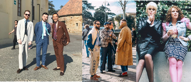
There's a lot of inspiration for sprezzatura-inspired looks on social media and in menswear writing since it tends to intersect with the question of "how to make #menswear interesting?", be it satirical (as in the costuming on Absolutely Fabulous in the 1990s), or earnest, as in places like StyleForum or through Ethan’s essays, particularly, of the Pitti Uomo trade show. Because being “stylish” is subjective, there’s often a thin line between ‘tasteful’ and ‘tacky’ which can differ from person to person.
It’s interesting to consider the varying degrees of effort possibly spent to dress like this: while there’s some people that could truly just grab things from their closet and walk out, there are several others spending lots of time mulling over each item of clothing to wear and how. Both approaches are valid, and depending on the day, I’ve found myself on both ends of this spectrum, and I felt inspired to try a bolder attempt of studied carelessness (given the nature of this competition, I acknowledge the irony). From a practical sense, it’s a style I've delved in before, but not one I favored because I usually don't find the effort worthwhile, however this was a notable exception.
What makes sprezzatura a fun aesthetic is that there are no real "rules". I funneled this broad inspiration down to “What would I wear if invited to Pitti Uomo next winter”, and in doing so found no barriers based on age, race, gender, size or even the *weather* to a degree. What was most important was the fit and what it conveyed about its wearer.
What makes it annoying is there are no real rules but there is an overarching sense of knowing if something is “good” or “bad” on sight. As mentioned, there’s numerous visual cues to this style and a near infinite number of ways to put them together, but no real guidebook on how to do so beyond an awareness of the traditional “rules” of dressing and how to break them well.
In my travels I found a lot of decent pieces but a lot of them would've fit well into fits I already posted to MFA and, while I did want there to be some degree of my personal aesthetic represented, I wanted there to be a distinction made for this last entry. Nothing grabbed me in the way I wanted, so I took matters into my own hands.
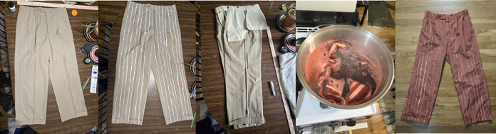
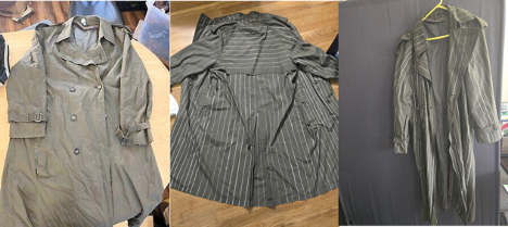
My intention was to create multiple hand-painted garments of different weights – a thin pinstripe, a thicker stripe that would give the appearance of being pre-printed fabric and, at one point, a patterned blazer to wear as contrast. This was a relatively long process involving lots of measuring, panting and washing, made difficult when balancing full-time work and general life stuff, was worthwhile
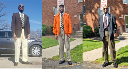
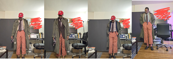
The fit from top to bottom:
Brown tortoiseshell sunglasses (in detail shot) from a random thrift store years ago
Painted olive London Fog trench coat
Brown herringbone Harris Tweed jacket off Ebay
Green/white J. Press striped sport shirt
Black printed vintage tie from Goodwill
Navy vintage suspenders from Goodwill
Pink/red painted pleated chinos from Goodwill
off white Uniqlo 50s socks
dark brown Cole Haan loafers
I emphasize all the pieces for two reasons, one because all the colors and textures balanced out without being overwhelming in one direction or another. Unlike with other entries there were several iterations of this final fit, and I am grateful for the feedback given. The most impactful changes were:
- Shirt pattern: initially a purple/white stripe, then red/white, and finally dark green/white. Both the purple and red felt “too” matching in a way I wanted to avoid.
- Socks: started sockless, then pink, then off-white. Given the layers up top it felt odd to be sockless, meanwhile the pink was not close enough to the pant color to match, but not far enough away from it to be an intentional mismatch.
- Cap: initially red, then after cycling through several options, became navy before removing it for the final picture. As we were taking pictures, it was clear I didn’t need it.
- Blazer: at one point tan, brown and navy were all considered, eventually settling on the herringbone.
I think the herringbone texture was an added dimension lacking in the other potential picks, especially since the blazer would serve as a visual break between the stripes.
The second reason is because literally everything pictured is secondhand aside from the socks. There's been discourse on MFA and elsewhere online about acknowledging the cost of clothes, especially for an average person, and how that’s a barrier to having good or better style. While I recognize that there will almost always be a financial cost in obtaining clothes, I think the counter to that is to be thoughtful about purchases and creative about how you approach fashion. I could’ve looked for a similar pant or coat at retail but would be constrained by what exactly I could find or afford, however in altering the clothes I had greater control over the final product. In this case, the extravagance in the fit I wanted is still there but it’s through being creative and thoughtful over spendthrift, and that's the mindset I strived for during this entire process.
The photos were taken by discord solipsist z at a local art gallery; the gallery had recently updated the exhibits from one featuring portraits, so we co-opted a meeting space to turn into an art studio.
Submitted entry:
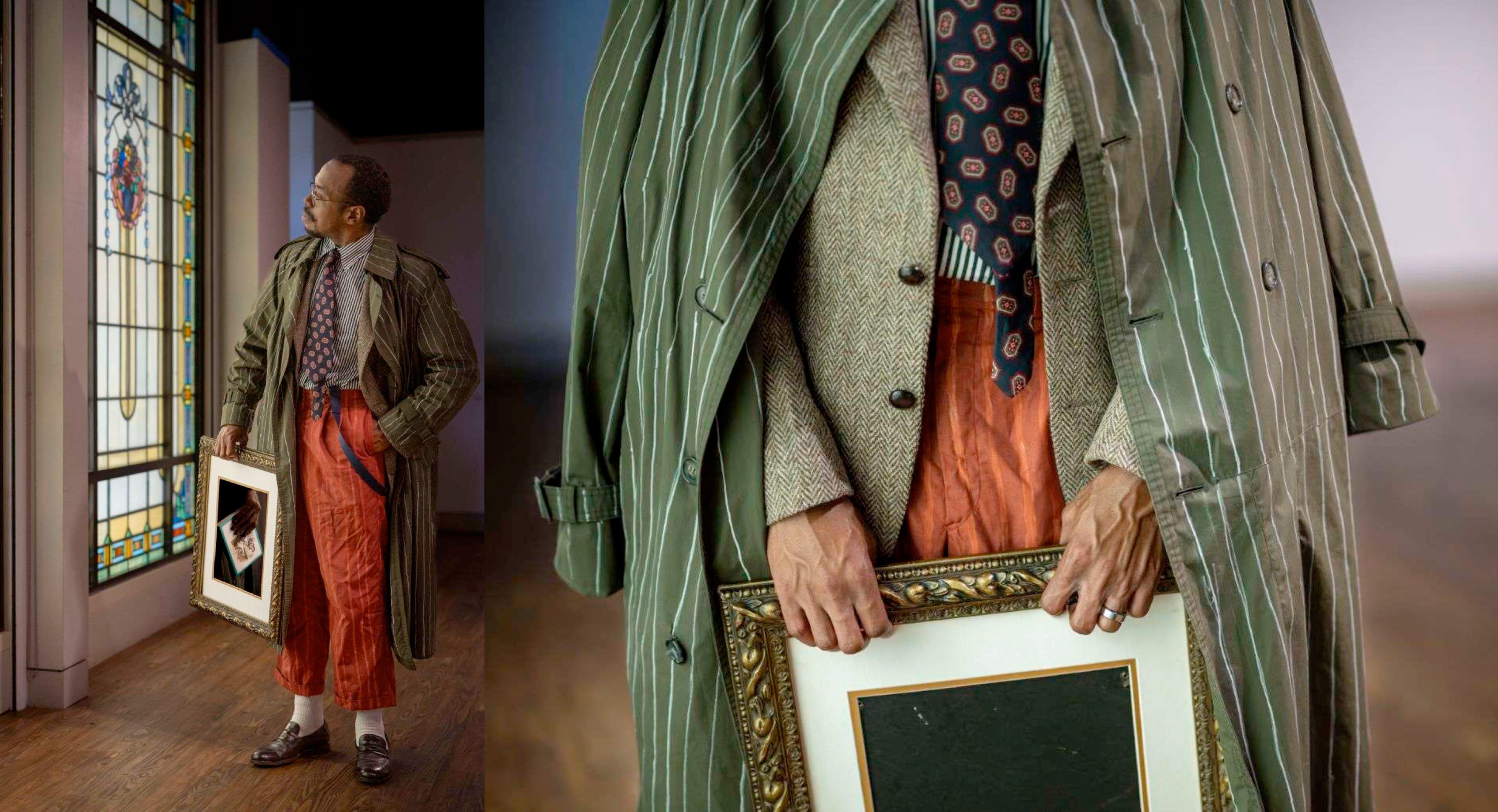
I originally was going to fashion the picture frame into a bag of sorts; however I couldn’t figure out how to flesh this out into a tangible product. In hindsight, I think it would’ve been too much of a gimmick compared to the umbrella-as-baseball bat, for example.
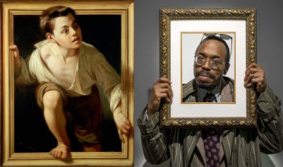
The portrait shot was inspired by one of my favorite works, Escaping Criticism by Pete Borrell del Caso, and the trompe l'oeil effect visually reinforced the idea of things not being what they seem, be it painted fabric or the ‘ease’ of sprezzatura as an aesthetic.
This was the most time and thought I’ve put into a single fit, and I am still impressed at the final result. There are clear elements of my own style, but it’s rendered through a bigger lens of how I respond to sprezzatura, and what that signifies about my views on fashion and of style at large. I’ve learned a lot about my own style and how to express it to the point where some things are automatic, but I found that in instances like this, there’s value in putting more effort behind this process, and that that effort can be rewarded.
Thank you for reading! You can click below for my final thoughts (as well as the details on the picture above)-

You can also find me on MFA Discord or Instagram to see more of my fits, to ask any questions about this essay, or to connect about clothes or life in general.